Admos
Admos needed a new identity to reflect their status as one of Belgium’s best architectural firms for next generation workspaces.
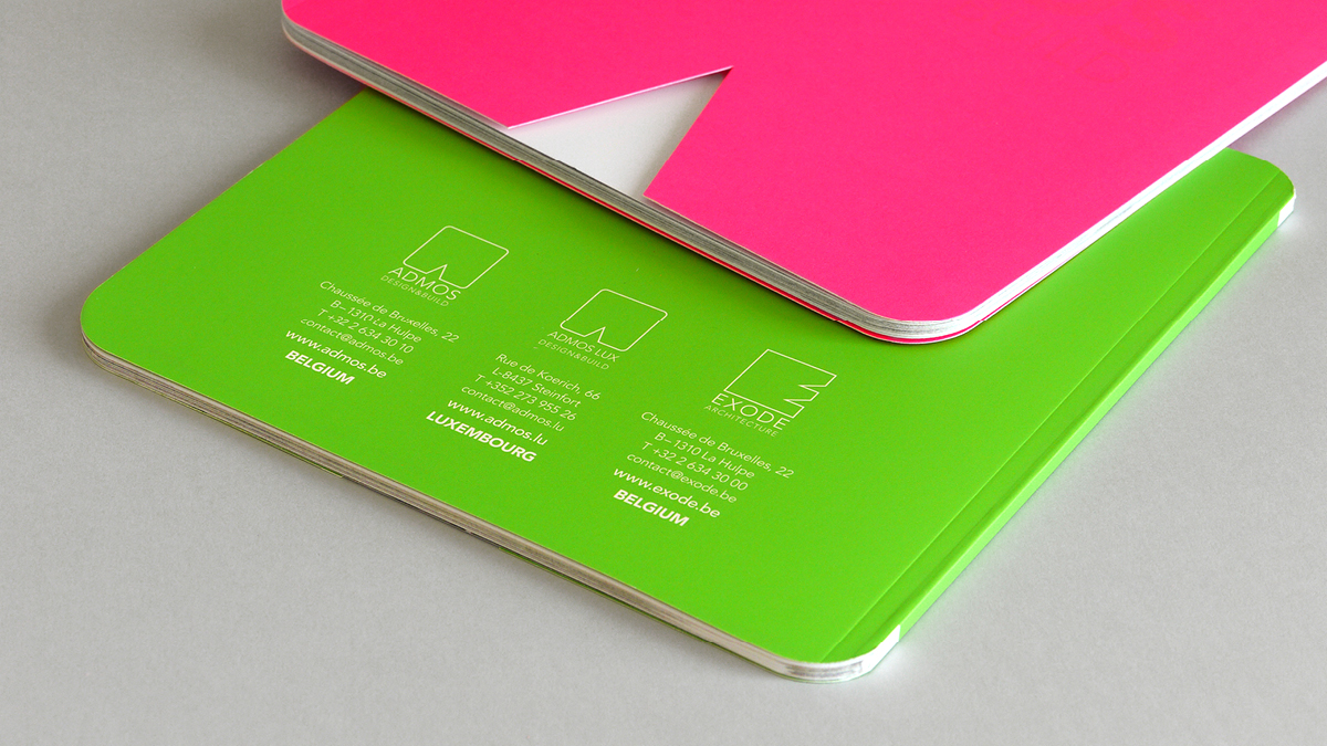
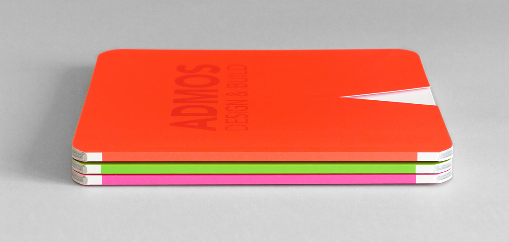
Ultra-modern
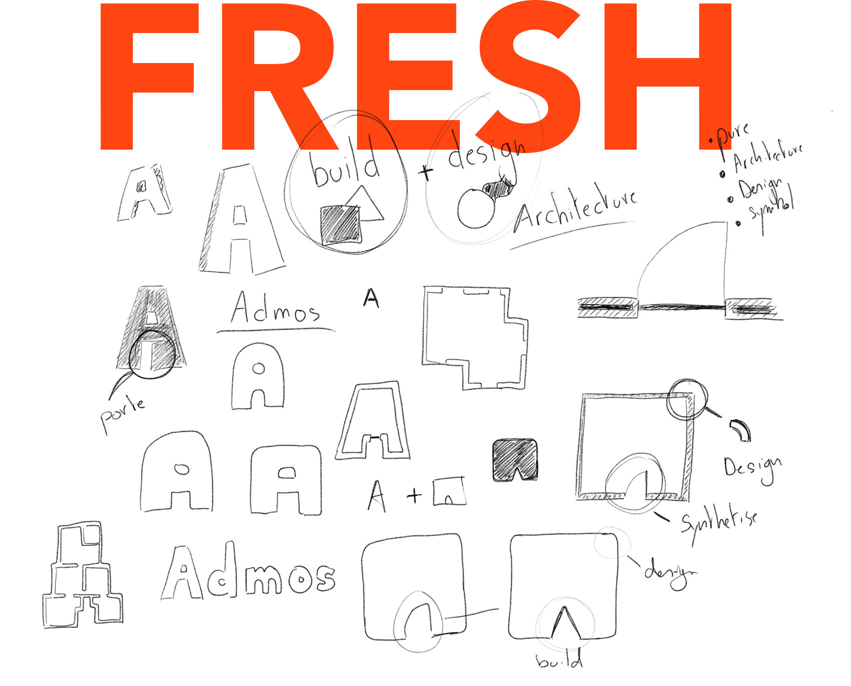
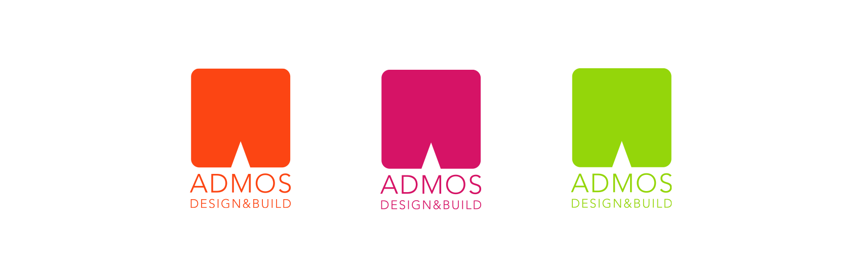
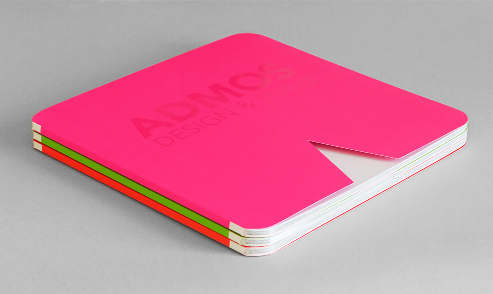
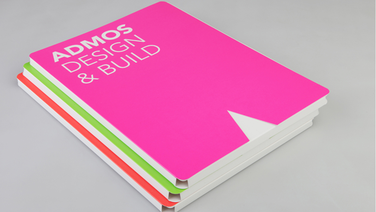
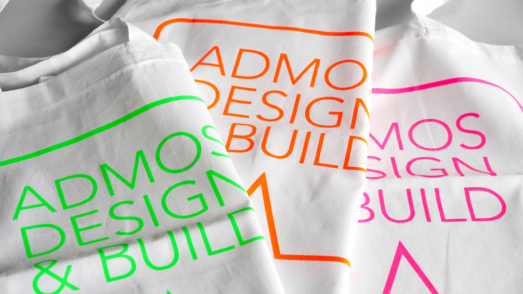
We created an ultra-modern logo with rounded corners and a triangular cutout that powerfully sets Admos apart. The unusual shape allows for super creative applications in everything from cards to brochures.
Electric colours
The electric colours we selected simply can’t be ignored. They scream out for attention, and they get it.
Powerfully set up
We created an ultra-modern and colourful logo with rounded corners and a triangular cutout that powerfully sets ADMOS apart. The unusual shape allows for creative and distinctive applications in marketing materials.