Solvay 2019
Solvay Brussels School asked us to revamp their homepage for 2019. Challenge accepted!
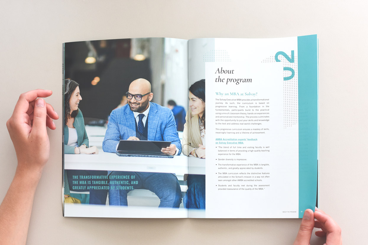
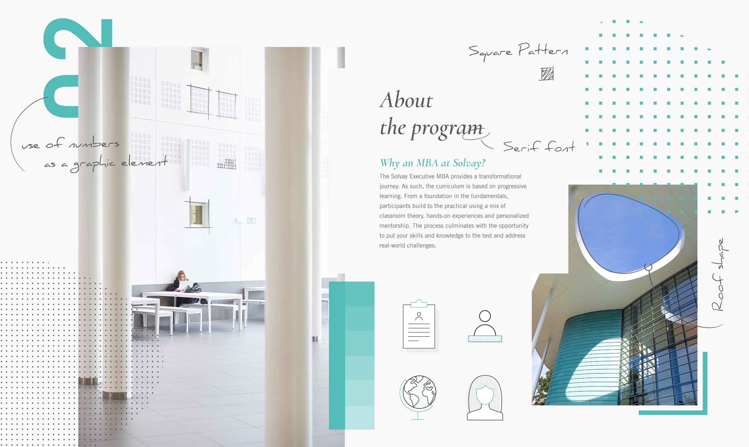
A new fresh look
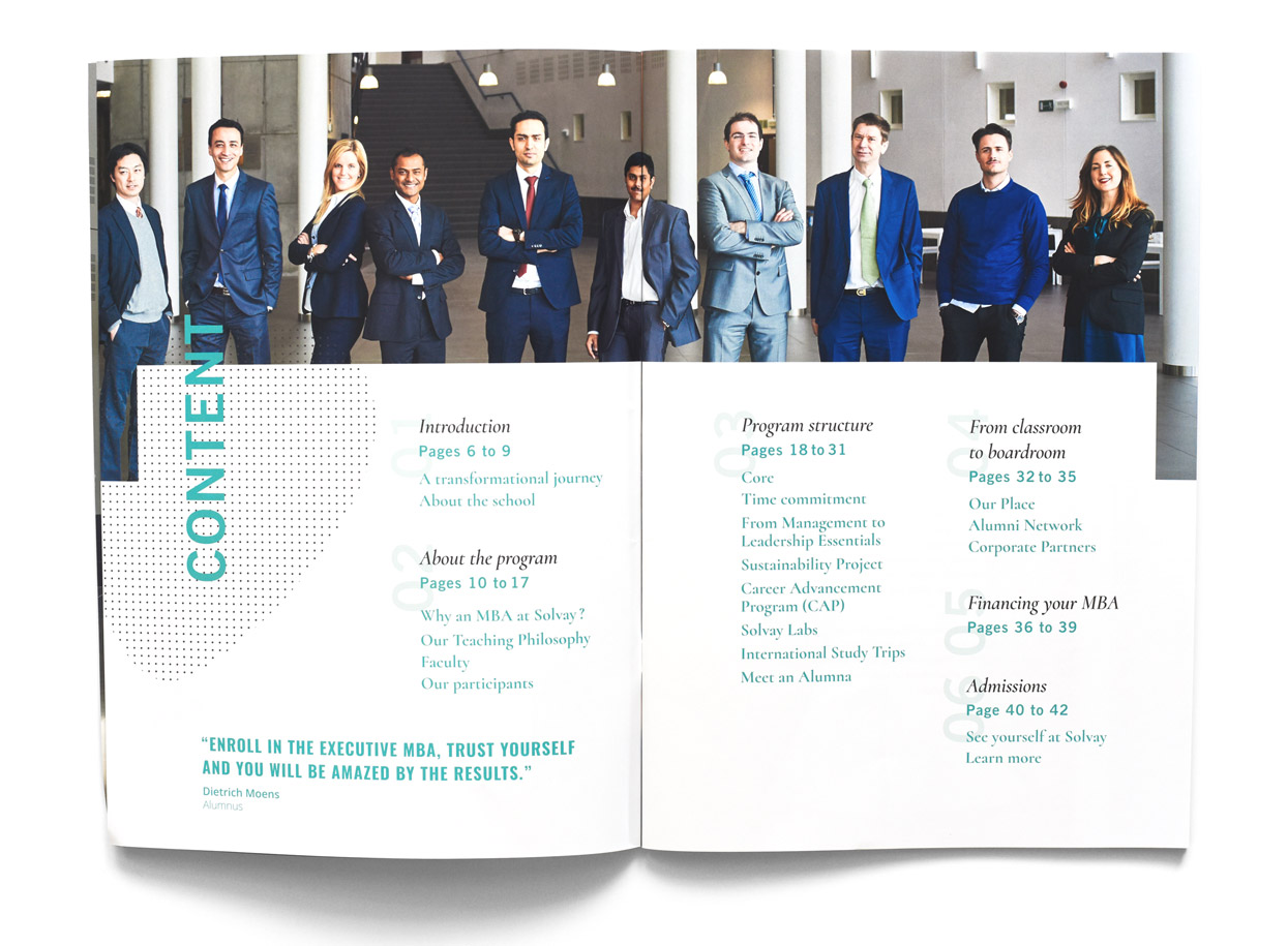
Based on our previous site’s structure and design of 2017, we revisited the look and feel of the EMBA site and brochure. Introducing a new, more modern typographic combination, new icons and a new pattern. Composed of small colored squares, this pattern is inspired by the architecture of the building. I’is based on the game of straight forms such as the square and rectangle both on the facade of their building and in the interior hall. This graphic element is reflecting a more smooth and oval shape which recalls the extraordinary and magnificent roof of the building. The more flexible grid allows us to play with the layout as well as with new graphic elements.
Print and online
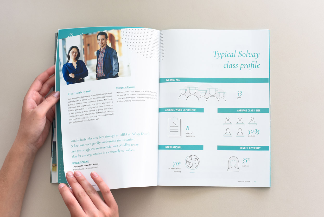
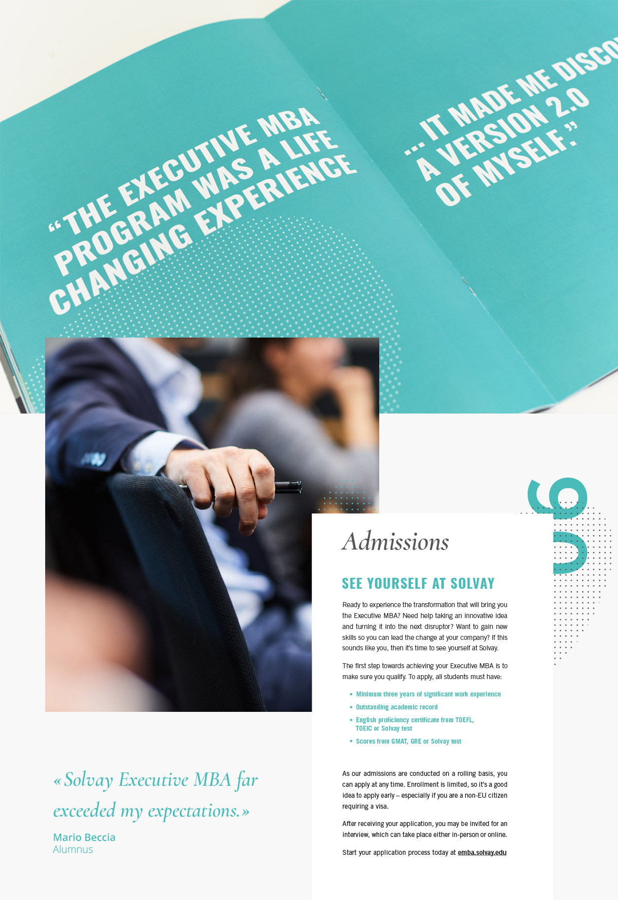
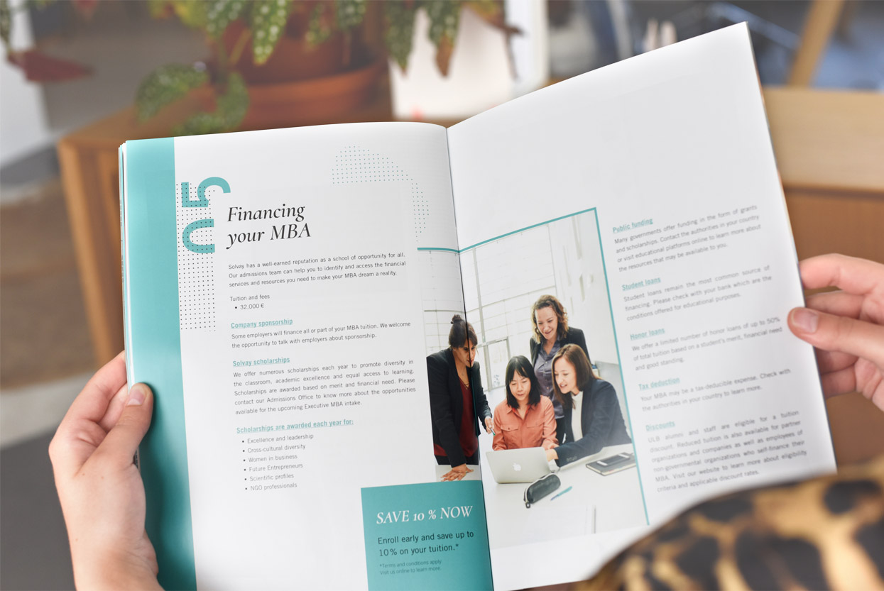
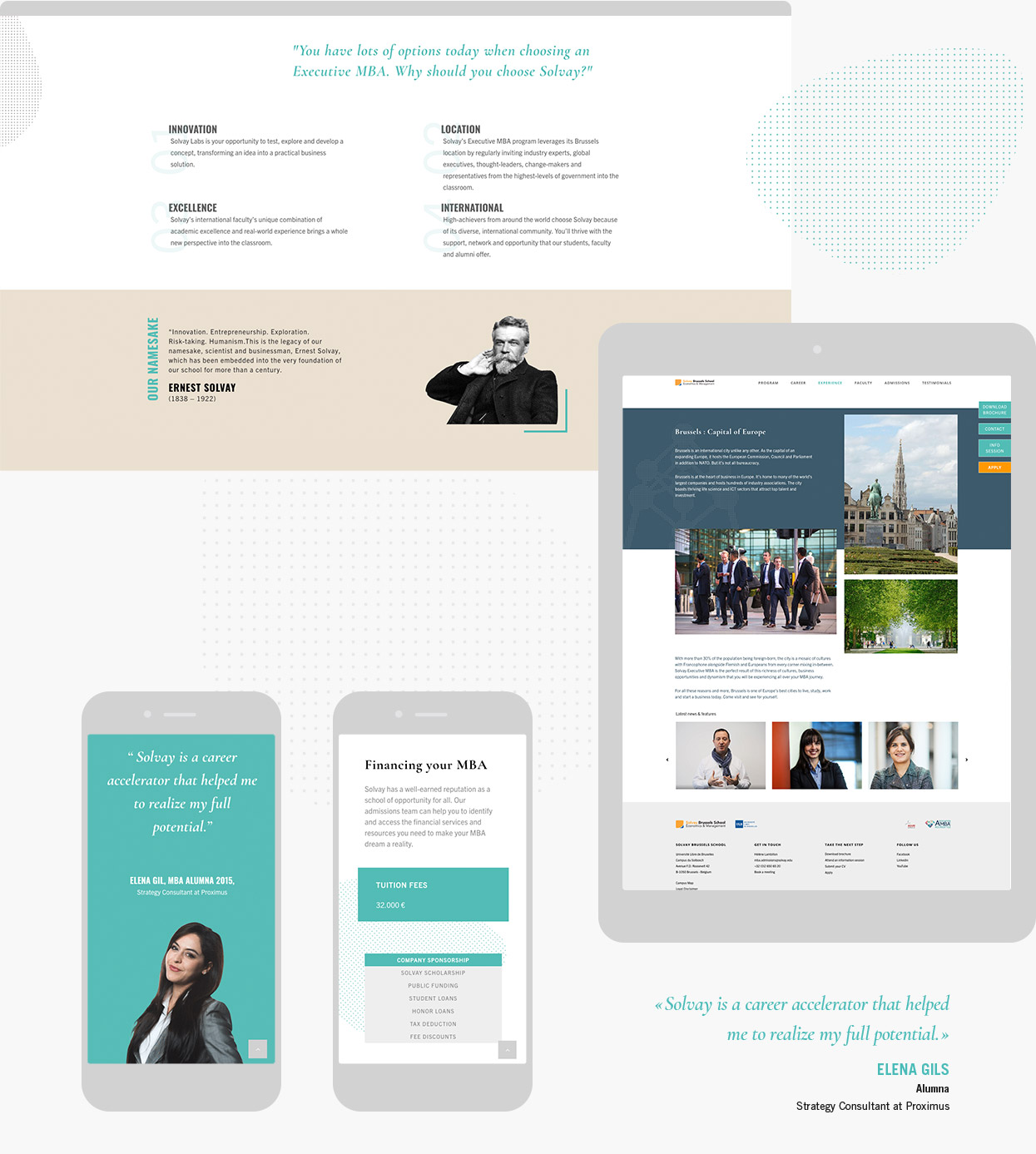
On both the brochure and the website, we are still focusing on using big key colorful images combined to the sea-green colour that now is EMBA’s distinctive color palette. Story telling by former students or teachers stays an important message for the EMBA promotion on all kind of medias, it makes it more human and accessible.