Stirrr
Stirrr sells a wide range of spice blends to create delicious drinks with many virtues. Like its brand, Stirrr is surrounded by a rich and colorful universe.
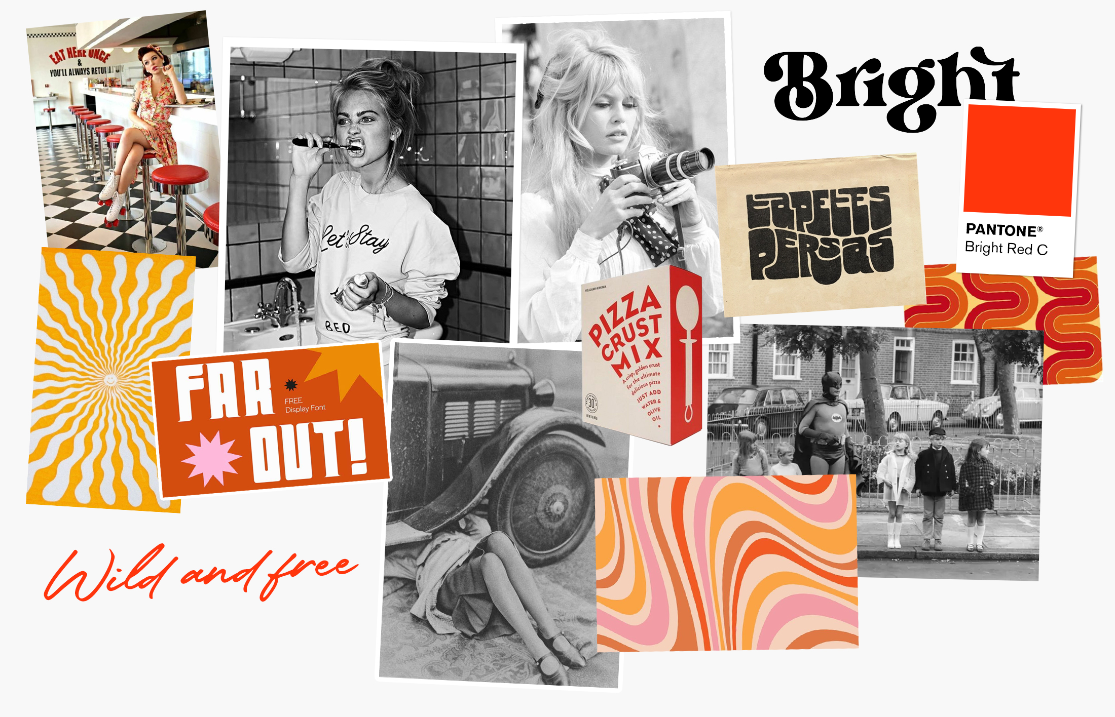
An inspiration straight from the 60s
The madness and emancipation of the 60’s represents perfectly the universe sought for Stirrr. A brand that dares to break the codes, full of character and style. These famous crazy years were therefore our starting point for all graphic research for the product. A few moodboards later, the first logo tracks with vintage typography and contrasting colors make their appearance. Stirrr wants to be above all a dynamic, young and pep’s brand, just like its creator.
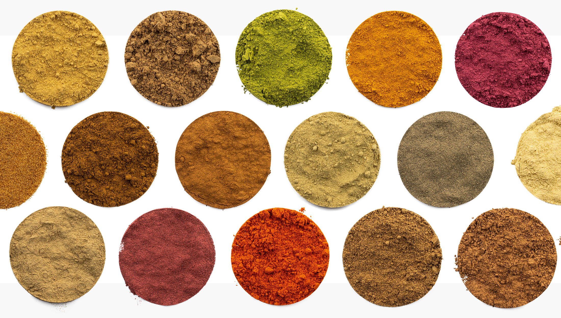
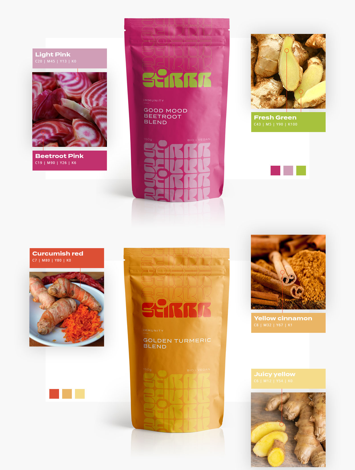
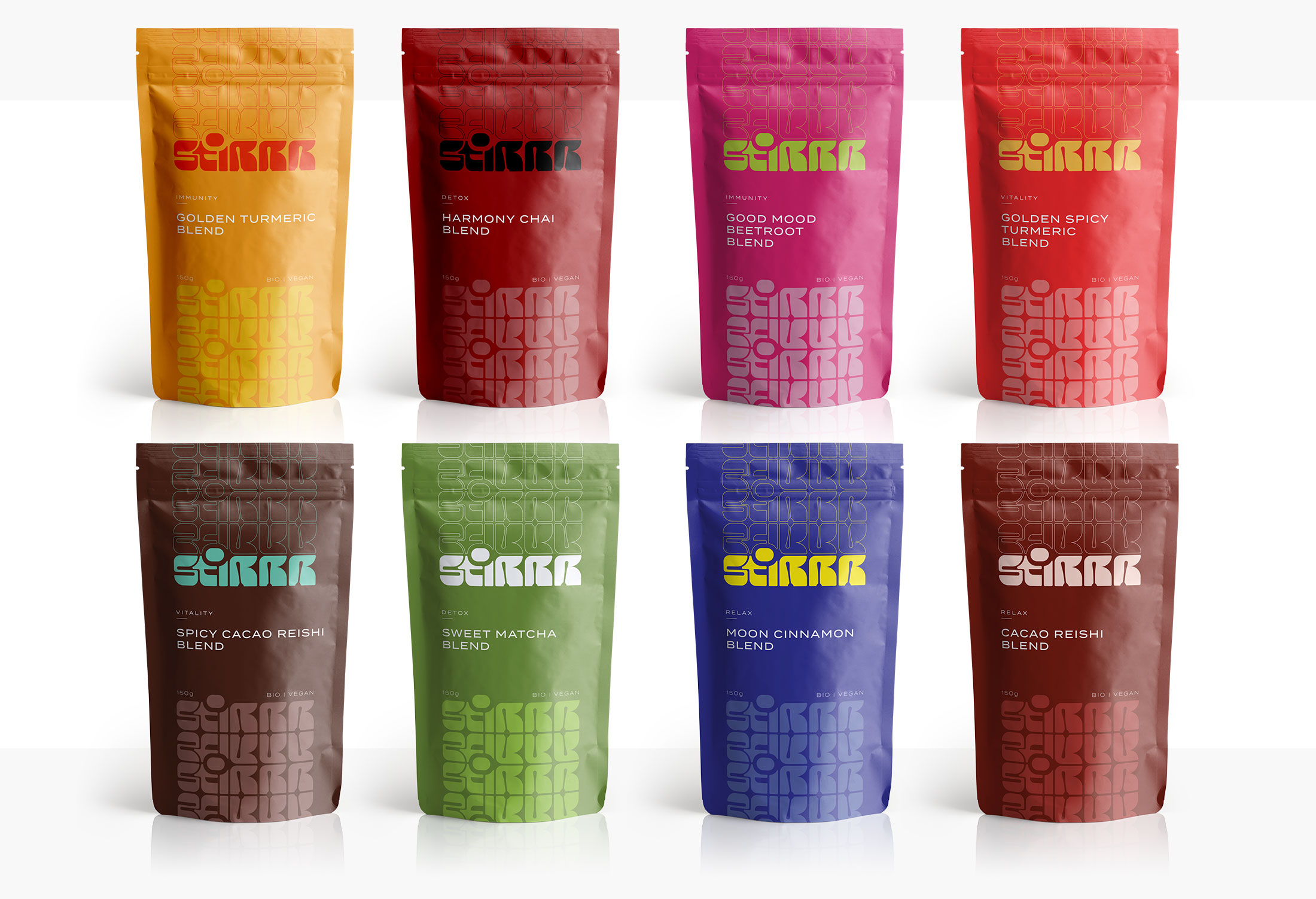
A wide range of colorful products
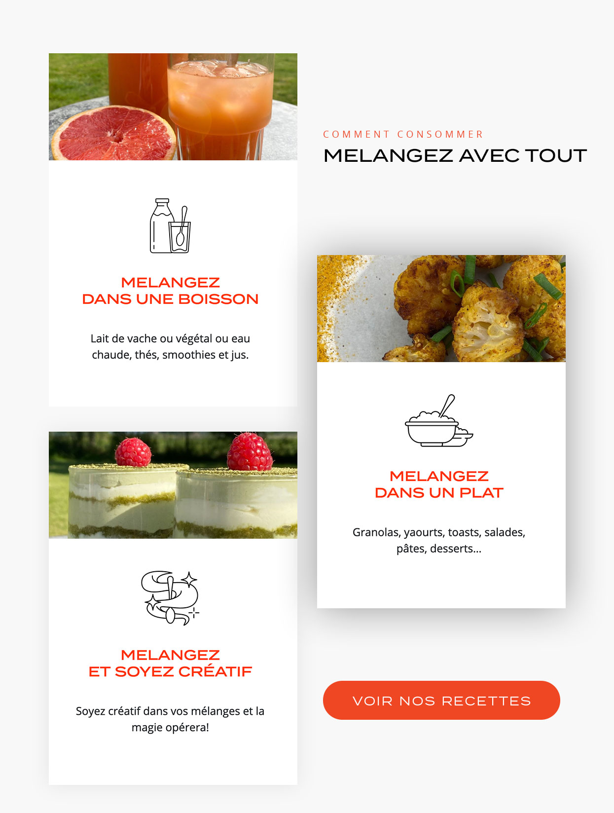
Color and more color! Far from the bland and boring packaging, it was important for us to create a colorful and cheerful packaging that will make the product stand out once installed on the shelf. A colorimetric study was undertaken for each spice blend to best represent its container. The color associations have been thought about in terms of their contrast and combinations in order to propose harmonious color palettes.
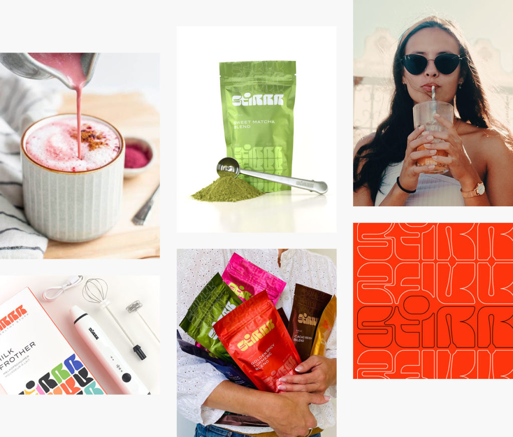
A webshop that reflects Stirrr’s spirit
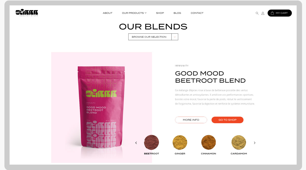
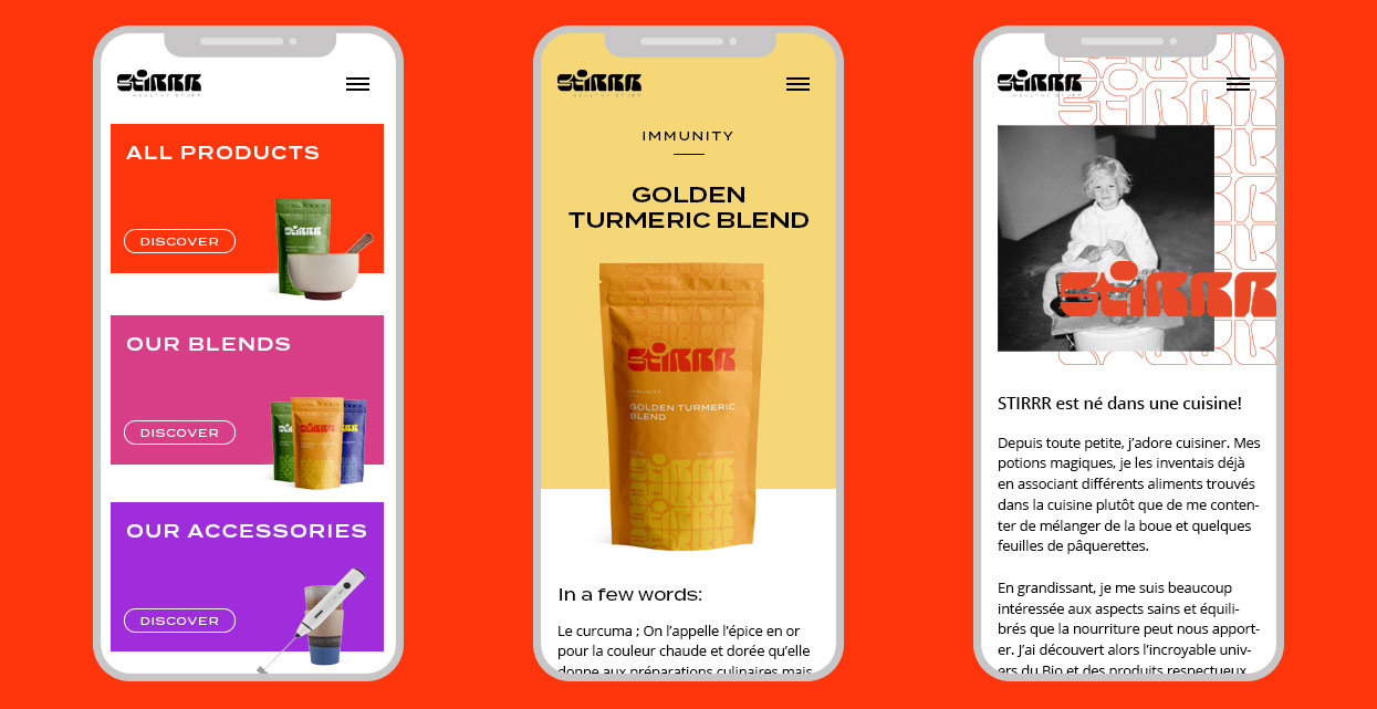
The main sales channel for Stirrr products is the website. It must therefore be perfectly aligned with the brand image and be instinctive for the consumer. We find the universe of Stirrr with its bright orange and the play of texture that brings the pattern created by the duplication of the logo as a graphic element. The place of the product is of paramount importance because it is the real star of the brand. The website is simple to use for the consumer but it is also for the customer. Automatic generation of invoices, direct contact with the delivery service, order tracking, all this is put in place to facilitate the work of our customers.