Biform
Since Biform offers a new approach to nutritional supplements, they needed branding to reflect their untraditional products. Our designs helped them stand out in a crowded marketplace.
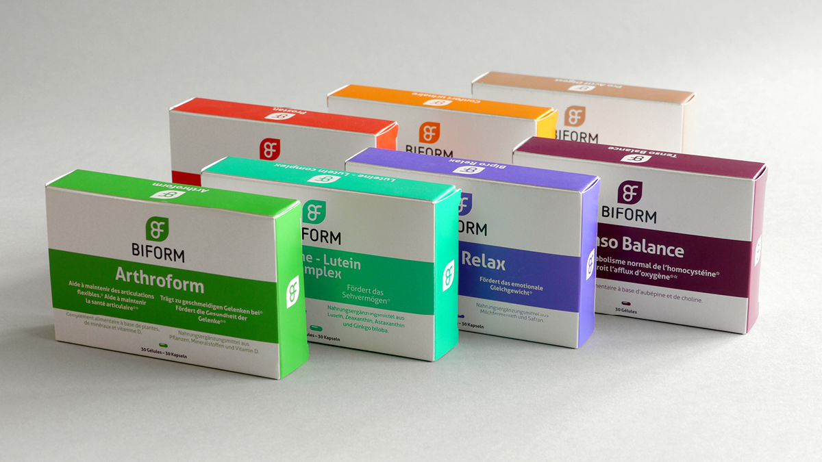
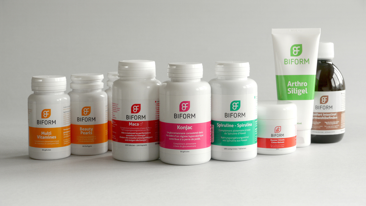
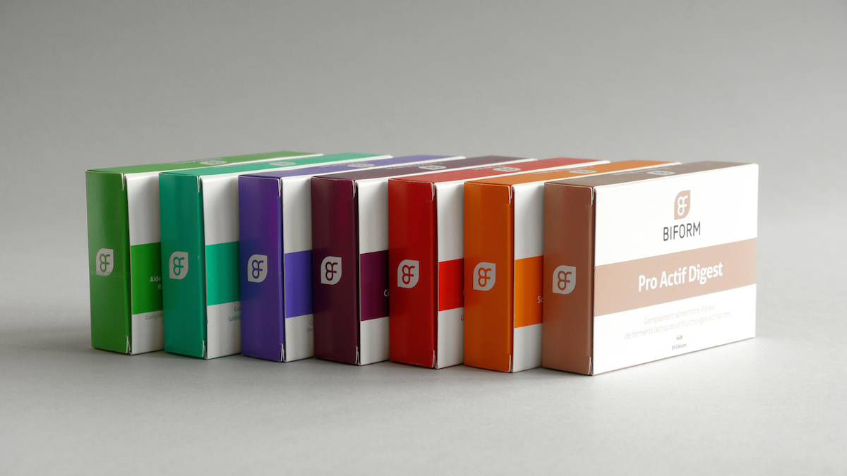
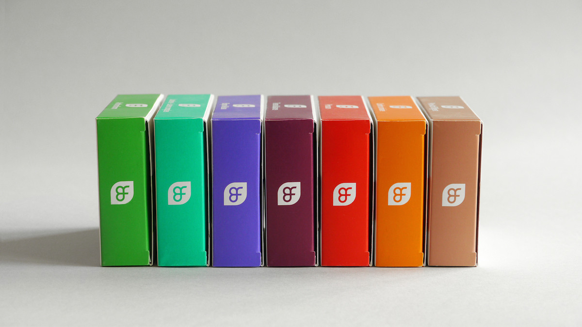
Colour is king
Too many brands rely on a single colour. We’re big fans of branding with pallets of colours applied to different products… all with the same logo and font styles, of course. This was our approach for Biform, and it was a huge success among customers who liked how easy it made differentiating between Biform products.
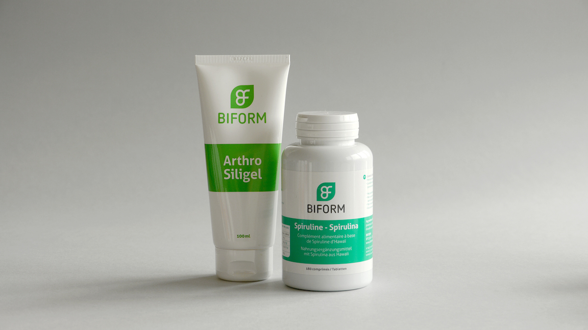
Flat is key
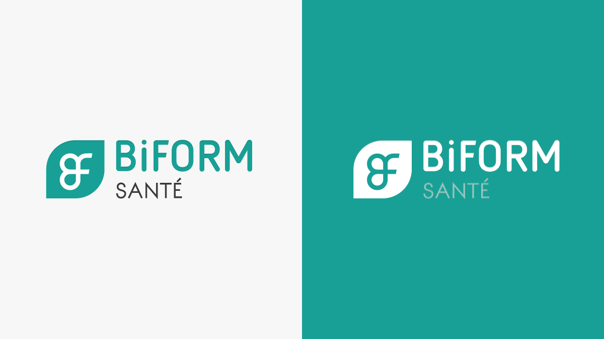
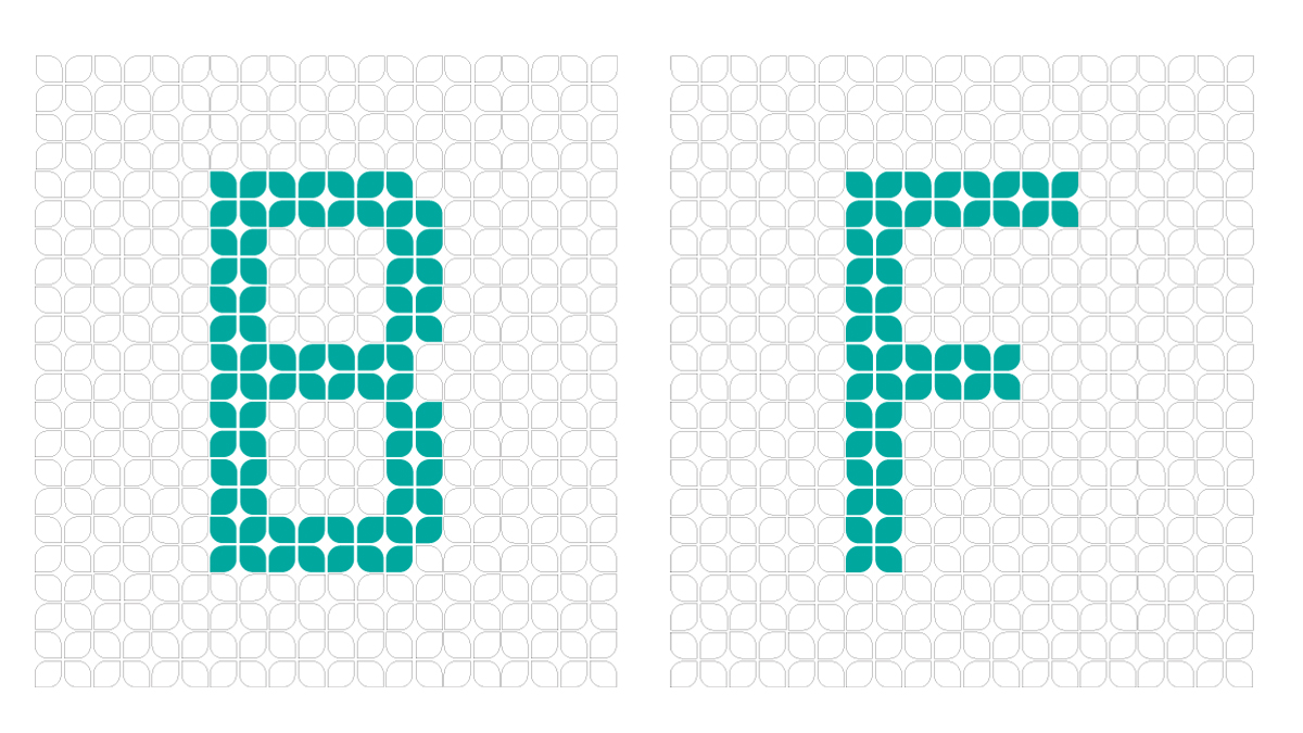
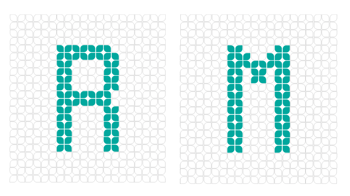
We used ‘flat design’ for the logo to keep it simple, clean and easy to adapt into different marketing materials. Since flat design is ‘on trend’ today, it also helps to reinforce Biform’s newcomer brand.